
|
The migration to Weebly Cloud that was scheduled for today, June 19th, has been postponed until early next week. We will update this page when an exact date and time has been established.
Thank you for your patience!
0 Comments
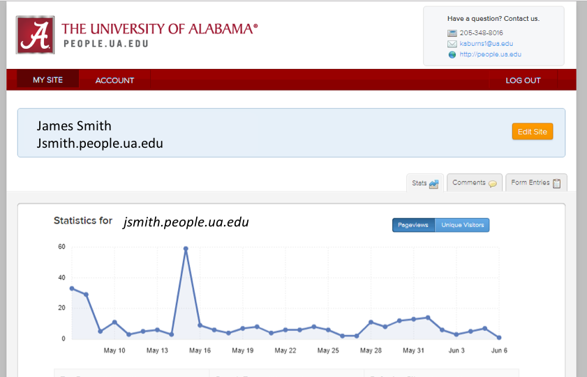
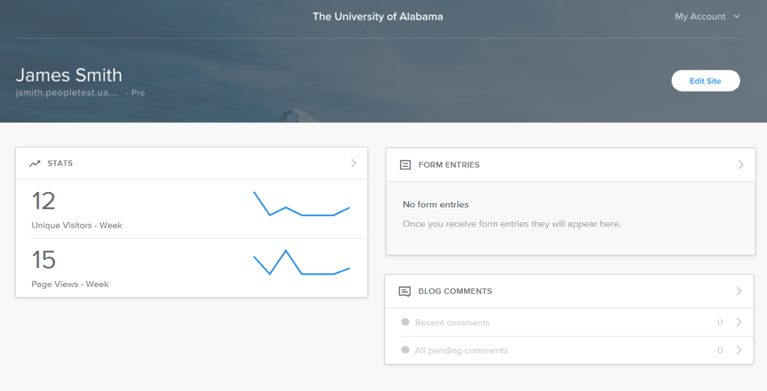
On Tuesday, June 19th, people.ua.edu websites will migrate from the Weebly Designer Platform to Weebly Cloud giving a fresh, new look to the dashboard page and providing a single sign-on location for users who manage multiple sites. Users will not see any changes in the site editor or the live version of their sites. Below is an example of the current dashboard and the new dashboard. Please note: The image of the new dashboard is from our test account which will look slightly different once we have fully migrated.
Migrating to Weebly Cloud should resolve the login issues we have recently encountered.
More changes will occur to the administration side of people.ua.edu. Weebly Cloud offers:
During migration, users will be unable to log into the site editor starting 2:30pm on Tuesday, June 19th. The process should take no more than one hour. There are more benefits and enhancements coming in the near future so be sure to watch for updates! The long awaited final three responsive themes are finally completed! These new themes offer some unique features not available on our other themes: sections, flexible headers, and video backgrounds. Sections Sections allow you to really customize your website! Adding sections takes just a few clicks:
Flexible Headers Flexible headers give you the freedom to drag on new elements, tweak content positions and dynamically change the height of the header area simply by dragging it up and down. With this feature, you can now control your header like the rest of your site content. Instead of using an image, change the background color to give your text more “pop” or add a slideshow! These flexible headers really ARE flexible! Video Backgrounds Video backgrounds provide extra charisma to your pages and can be added to both sections and flexible headers when you customize backgrounds. You can access video backgrounds from Edit Background within the section element or during header customization. You can upload your own video or choose from a gallery of curated videos. If you see something you like and want to change from your current template, let me know which one, and I'll be glad to apply it for you. All your content will carry over to the new design with one possible exception: the images used in the header, either as a single image or as a slideshow. These images may NOT carry over. They may need to be uploaded again.
Visit the Themes page to view our new designs. Can't wait to see what great things you do with these new themes! Karen Congratulations to our latest exemplar websites!!
All three did a great job! Visit the Showcase page to view the new sites. We have several more great sites to showcase and hope to begin updating the page on a monthly basis. Will your site be next?! Recently, our web provider, Weebly, updated its image editor. While it is a GOOD thing for the average image, it is not such a good thing when it comes to uploading a logo and adding text to the site title. Unless you want to make a change to your site title, this update will not adversely affect you.
The new editor recognizes the current site logo and title as a single image. As an image, the text cannot be edited. No worries, though, it simply means we had to make a change to the logo itself allowing empty space for new text to be added. Just HOW we fixed it isn't really that important. What is important is that you know how to update your site! For those who want to edit the site title, follow the instructions on our Site Title and Logo page or feel free to contact our office and we’ll be happy to make the change for you. Karen
If you find that your site is looking a little bland or have ever wanted to add some color to your page, you're in luck! We've added a short tutorial covering all the steps you'll need to add a colored text box to your site through the use of the Embed Code Element. Check it out here!
Harrison As we move into Fall, it is time once again to pick our new Showcase sites! Congratulations to:
Harrison Have you heard the news? The responsive themes are here! And we think you’re going to love them!
So what’s the difference in these new themes and the ones we currently offer? Aside from a new, sleek, modern look, these themes were constructed with “responsive design”, enabling your website to automatically respond to any device and optimize the user experience. As stated by Weebly (2015), “Responsive websites are built on grids that can collapse, expand, and stack based on the environment they’re responding to. They do this with CSS media queries, flexible layouts, and design elements that can resize and scale on the fly. The result is a single website that can change instantly whether it’s being viewed on a desktop monitor, retina-ready iPad screen, or Android device.” Each theme meets The University of Alabama web design standards.
It's finally Summer and we kick it off with three new websites in our Showcase! Congratulations to:
Enjoy browsing through these great websites on the Showcase page and let us know your thoughts by leaving a comment! We would love to hear from you. Karen It's that time again... We've chosen three recently published sites to showcase this time around. Here's the lucky trio - and what rocks about their online presence.
|
Archives
November 2021
Categories
All
Follow us! Right-click and copy the link below. Create an RSS feed right in your Outlook or other feed reader application.
|
 RSS Feed
|
|
Accessibility | Equal Opportunity | UA Disclaimer | Site Disclaimer | Privacy
Copyright © 2024 | The University of Alabama | Tuscaloosa, AL 35487 | (205) 348-6010 Website provided by the Center for Instructional Technology, Office of Information Technology |