
URLs as Links
Web addresses, or URLs, present two types of challenges:
- Readability
- Length
URL Readability
The first challenge is that URLs are not always human-readable or screen-reader friendly. Many URLs contain combinations of numbers, letters, ampersands, dashes, underscores, and other characters that make sense to scripts and databases but which make little or no sense to the average person. In many cases, it makes sense to use human-readable text instead of the URL. The human readable link Constructing Accessible Websites external link is more user-friendly than the link to purchase the book by the same title on Amazon.com, which consists of a 108-character link full of numbers, slashes, and text that is not very human-readable:
(http://www.amazon.com/exec/obidos/ASIN/
1590591488/qid=1116957951/sr=2-
1/ref=pd_bbs_b_2_1/103-5755258-8204633 - external link).
Does this mean that URLs should never be used as links? No. If the URL is relatively short, there is probably no problem with using the URL as the link text. The key is to be considerate of screen reader users who must listen to the longer, less intelligible URLs.
URL Length
The second problem is that some URLs are quite long, and some browsers refuse to let long URLs wrap to the next line, so the links extend off to the right beyond the visible area of the browser. These long URLs are generally generated by database-based websites or Web applications that transfer a number of variables through the Web address itself. The above link to the book on Amazon.com is a perfect example. In fact, the long link text was modified by adding two spaces in the middle of the URL, to allow it to wrap to the next line. Mozilla-based browsers such as Firefox and Netscape do not allow long URLs to wrap unless the author introduces a space somewhere.
The original width of the following screen shot was over 2000 pixels, stretching across two monitors. Imagine placing a long link such as this in a Web page. Users would have to scroll a long distance horizontally in order to read the entire thing.
The original width of the following screen shot was over 2000 pixels, stretching across two monitors. Imagine placing a long link such as this in a Web page. Users would have to scroll a long distance horizontally in order to read the entire thing.
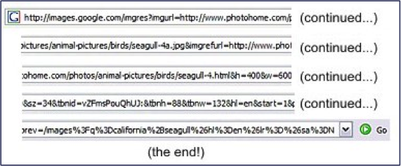
Even worse, imagine listening to the link with a screen reader! Hardly anyone would ever have the patience to listen to all of that indecipherable mess. The link above could be shortened to "California seagull stock photos," since the link goes to a page with stock photography of California seagulls.
Alternative Text for Images Used as Link
When images are used as links, the alt text performs the function of link text. As with linked text, the alt text of linked images does not need to inform users that the link is a link, since they already know. One interesting dilemma though is to decide how important it is to describe the visual characteristics of the image in the alt text, since the purpose of alt text is to substitute for the image in cases where users cannot see it. In most cases, the visual characteristics of the image are less important than the link destination.
Example
The graphic in this example could be described as "a horizontally-aligned, pill-shaped, somewhat three-dimensional-looking object, with royal blue on top fading to red on the bottom, with the colors slightly darker on the left side and slightly more washed out on the right side, with the word 'Products' written in white bold Arial text on top of the pill-shaped object, suggesting that the object is a link to a list or explanation of products."
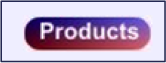
The description would be entirely accurate, but quite unnecessary. The purpose of the graphic in this instance is to link to the products section of a website. The alt text should reflect the purpose of the graphic more than its visual appearance. Most screen reader users will not care what the button looks like, especially if the description is long. An alt text of "Products" will do nicely.