
MAXIMIZE USABILITY
WITH DESIGN
It may feel intimidating to approach the initial build of your site. Rest assured that good design is simple, and that's now a scientifically proven fact. Harness the power of time-tested design principles to guide you through the complex decision-making process of structuring and developing your site.
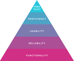
Functionality and reliability are the foundation of good design. Much like Maslow's Hierarchy of needs, there is a generally agreed upon design hierarchy of needs. Develop your custom system of design guidelines to apply to your content with these priorities in mind. The consistent application (and purposeful breaking) of your design rules will generate the predictability and functionality that a successful website requires. There are many benefits to applying design principles to your site-building process. For example, good organization and thoughtful structure aids is often accessible and accessible designs are more inclusive. Below are tips and fundamentals compiled from different corners of the internet. |
Overview |
Design Fundamentals
Hierarchy
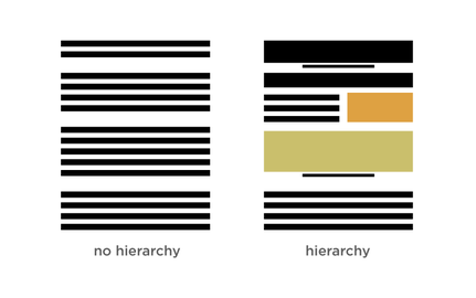
Good hierarchy in design exists when the most important element is seen first, the second most important, second, etc. You can use contrast through size, color, layout, and white space to create hierarchy.
|
Quick tips to confirm appropriate visual hierarchy:
Learn More:
|
Grid
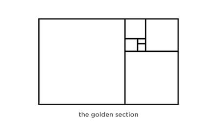
Grid systems enforce order and clarity in the layout of your content. Luckily, with people.ua.edu and Weebly, most of that guess work is taken out of the design equation. However, it's important to be aware of proper spacing and alignment in support of consistency, balance and hierarchy.
|
Quick tips on applying grid principles to your layout:
|
Negative Space/White Space
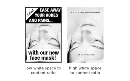
White space is the emptiness that surrounds the elements that make up your site's content. White space, or negative space, can draw attention to, accentuate, and provide context for design elements on your site. The white space around your content is a vital contributor to its' readability. White space helps to reinforce hierarchy, is key in organizing your content and can let you create and control emphasis.
There is no one-size-fits-all for managing balance through white space. Create your content-specific white space guidelines and apply them throughout your site, consistently. Inconsistency with these important details makes your user work harder than they should have to. Don't give your user a reason to leave your page. And remember, if you're unsure of whether you have adequate white space, enlist a handful of friends or colleagues to give you feedback. |
White space between paragraphs and in the left and Quick tips on adding white space to your layout:
Examples of excellent use of white space: The University of Chicago Learn More:
|
Color
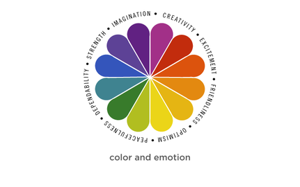
Text should always be readable. Distracting or illegible colors will undermine and obscure your message. Be aware of the emotional connotations of the colors you are choosing, and be consistent and deliberate with your choices.
|
Quick tips on using color:
|
Typography
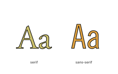
When considering a theme or layout for your site, be sure you're able to justify your decisions. This approach will ensure that your design will support your content. A distracting typeface or style undermines your message. Your priorities in choosing type and determining layout should begin with readability, followed by content-appropriateness, and lastly, aesthetics.
|
Quick tips on typography:
|
Choosing Imagery
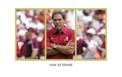
Quality imagery lends credibility and sophistication to your content. The opposite also sends a message. It's important to take the time to acquire the highest quality imagery available to you.
Choosing the appropriate imagery for your site begins with understanding your group's goals for the site as well as your content. Form should always follows function and imagery should never be used solely as decoration. You risk distracting or confusing the user when you include irrelevant imagery. You can evaluate the effectiveness of an image by determining whether it illustrates something new. If you find your content can live without the image, it's usually best to find an alternative. |
Quick tips on choosing imagery:
|
UA Brand Continuity
It's important to ensure that your website is complying with all UA branding application guidelines, where applicable. Let's do our part to foster brand continuity for all UA groups. With your help, anyone that interacts with the UA brand, can do so in a predictabl
Brand continuity is the consistent and uniform application of a branding system. Strong brand continuity connotes credibility and builds trust. You can buy into that trust by applying the UA logos, color palettes according to the guidelines laid out in UA's Graphic Standards Manual. |
Promoting consistency for the University brand has a dual purpose: It unifies the UA family, setting us all on a shared path of helping the Capstone achieve excellence, and ensures people everywhere associate the Alabama name with strength and distinction. UA Brand Checklist:
|
Elements of Design
The building block elements of design are listed below. These terms and concepts will help you make informed decisions about the design of your site.
|
1. Line
Helps direct the eye Creates emphasis Gives a sense of movement 2. Scale Draws attention to and from certain elements Creates emphasis 3. Color Create a palette Use the right color process (rgb vs. cmyk) Consider Color Theory 4. Repetition Ties elements together Crucial for brand unity 5. Negative Space Is the space between elements Important for logos 6. Symmetry Creates sense of calm Pleasing to the human eye 7. Transparency Supports element interaction Can be used to create movement Best when used intentionally |
8. Texture
Best when used intentionally and sparingly Lends depth and tactility to the design 9. Balance Consider the visual weight and importance of each element Balance your composition accordingly 10. Hierarchy Signals importance of each element Use the design principles to achieve good hierarchy Designer uses principles to control the experience 11. Contrast Creates emphasis Light vs. dark, thick vs. thin 12. Framing Highlights elements Can be aesthetic or compositional, but best when intentional Can allow for cropping 13. Grid Mathematical division of space Supports clarity and proper alignment |
14. Randomness
Intentional rule breaking Asymmetry and clutter, when used deliberately can be effective design tools 15. Direction Use of hierarchy to direct the user's eye 16. Movement Brings life to content Active compositions indicate movement 17. Depth Dimensionality in 2D objects utilize texture, shadow and horizon lines to indicate 18. Typography Use wisely and carefully 19. Composition Purposeful arrangement of elements Use scale, depth and hierarchy |